ArcGIS Maps With Power BI

ArcGIS by Esri is now a built-in feature in Power BI to provide enhanced mapping capabilities taking it beyond the presentation of points on a map to a whole new level. It enables to attach layers of demographic data to a map with ease. The combination of this location-based data layers on a map with spatial analysis conveys a deeper understanding of the data in your visualizations.
With increased popularity and usage, we at VNB did a deep dive exploring some capabilities and features of ArcGIS maps with Power BI.
This example highlights the following:
- Yearly statistics of US’ busiest airports by passengers
- Yearly statistics of US busy airports
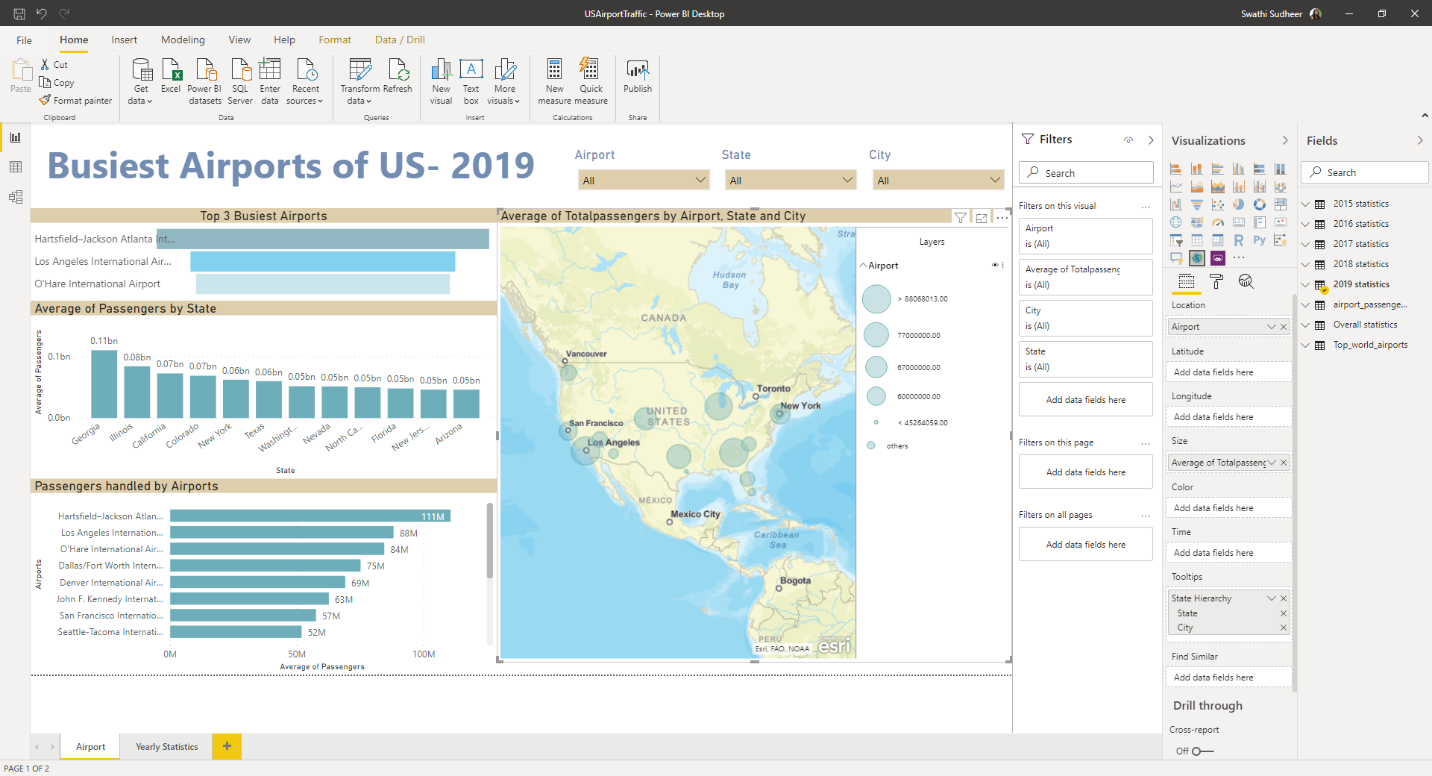
Figure 1 Landing Page of the PBI Report
Street Base Map report
Street base map contains three pins (Blue, Grey and Red) which plot the top 3 busiest airports in US in the following sample report.
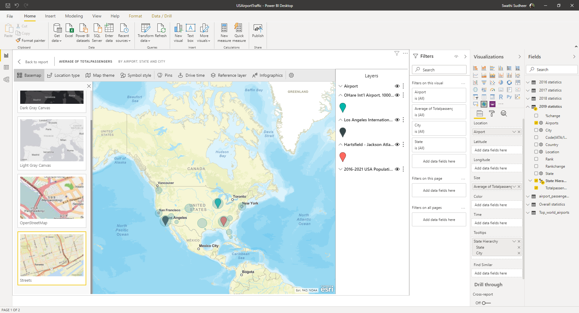
Figure 2 Street Base Map Report
Detailed Street Maps report
For the detailed street map’s report, we pan and zoom for the map updates. Zoom in will increase more detailed street and transportation information. When we pan from one state to another UX is constant level of details. In the below sample report, we’ve zoomed on Hartsfield-Jackson Atlanta International Airport.
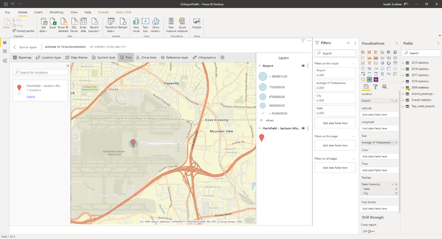
Figure 3 Detailed Street Map’s Report
Reference Layers Report
To highlight the capability of Reference layers as hosted by Esri, in the sample below we can see an additional layer of demographic information about locations. Here we see the reference layer for 2016-2021 population growth where the darker colors represent the higher density.
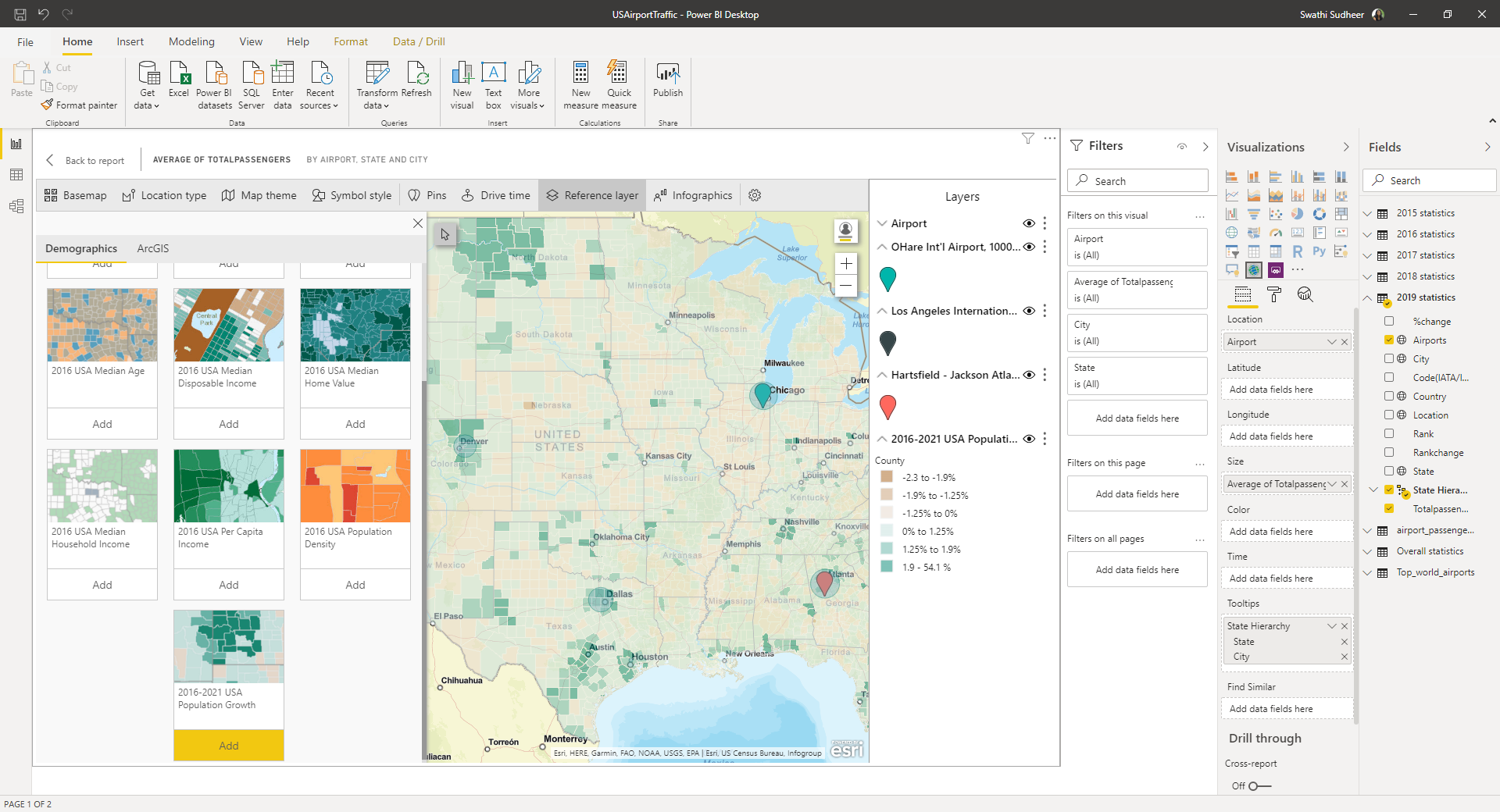
Figure 4 Reference Layer
Visual Indicators
The Map Visual displays the information of all
the visual indicators used in the map. It is displayed along the right side of the visual canvas in the sample report below.
In the below sample we can see the following
- Different sizes of bubbles indicating different ranges
- Three different colored pins plotting Airports that are; O’Hare International Airport (Blue), Los Angeles International Airport (Grey) and Hartsfield–Jackson Atlanta International Airport (Red).
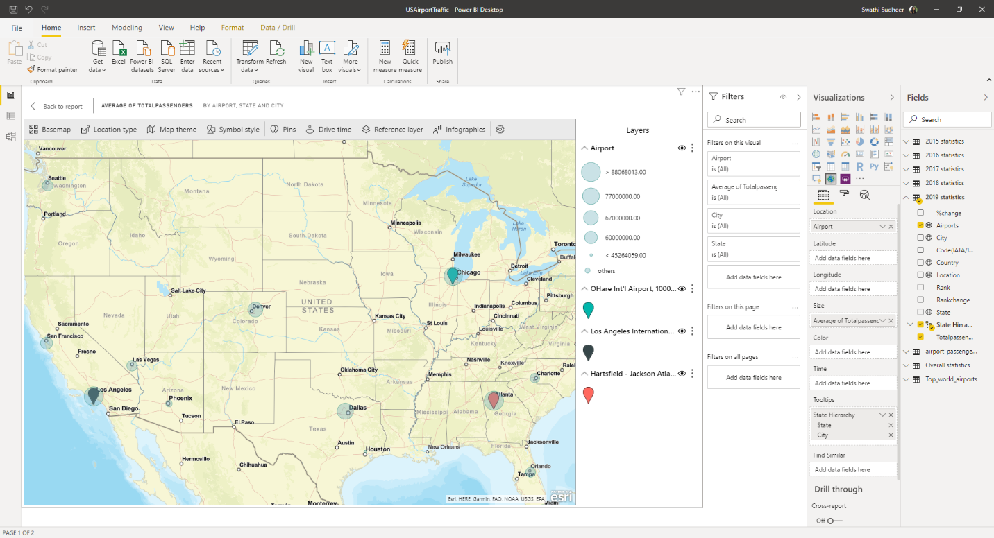
Figure 5 Visual Indicator
Heatmaps
Heatmap is a type of base map with which we plot the intensity of data on the map. Areas of higher activity or value are represented by stronger and glowing colors. In sample report below as the number of passengers gets intense, the area is plotted with stronger and glowing colors.
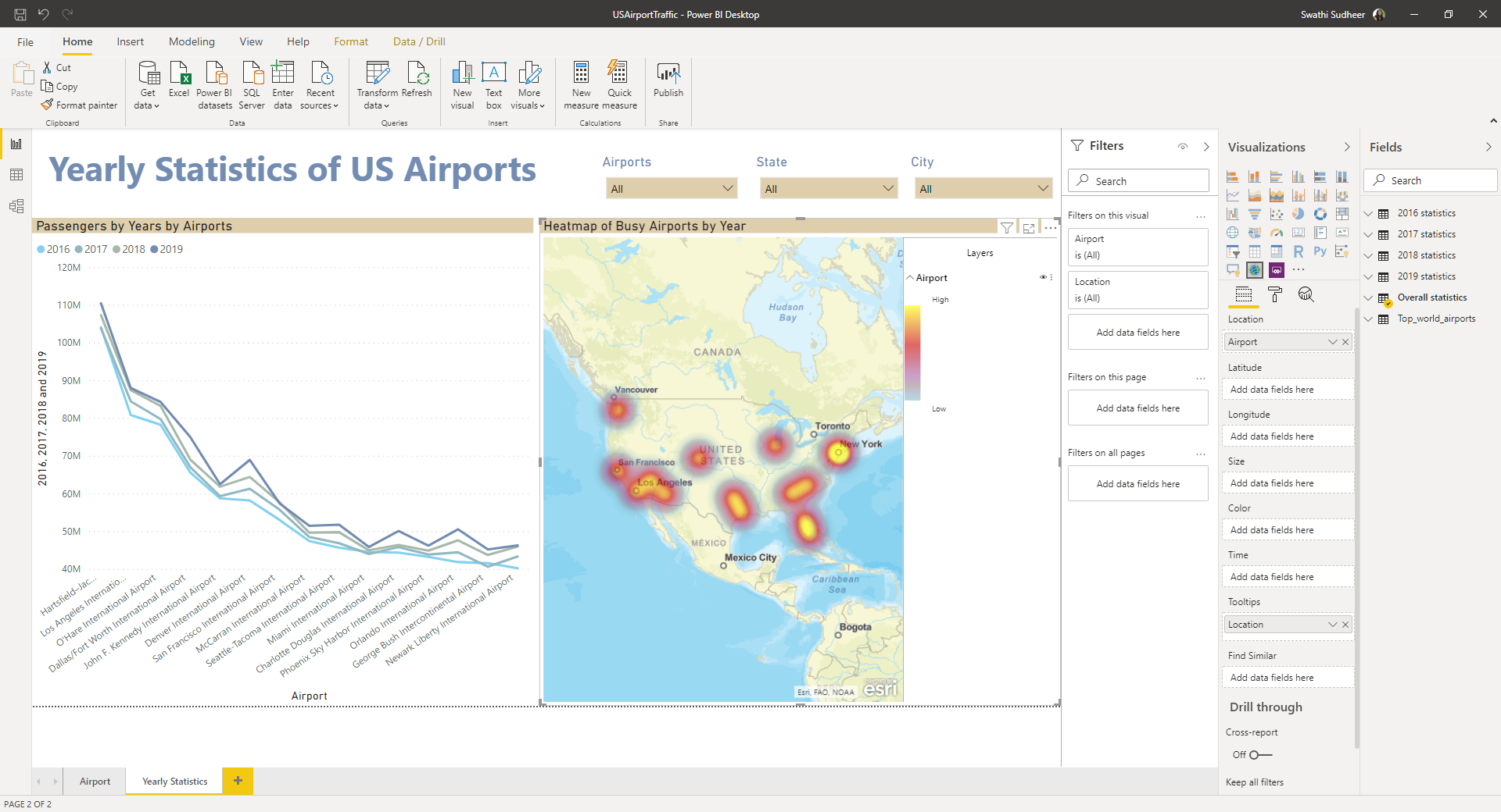
Figure 6 Heat Map
Tooltips
We can hover over base map locations (for example, a bubble) to reveal tooltips. Additionally, we can use the ArcGIS visual selection tools to display additional tooltips, and to make specific selections on the base map or reference layer.
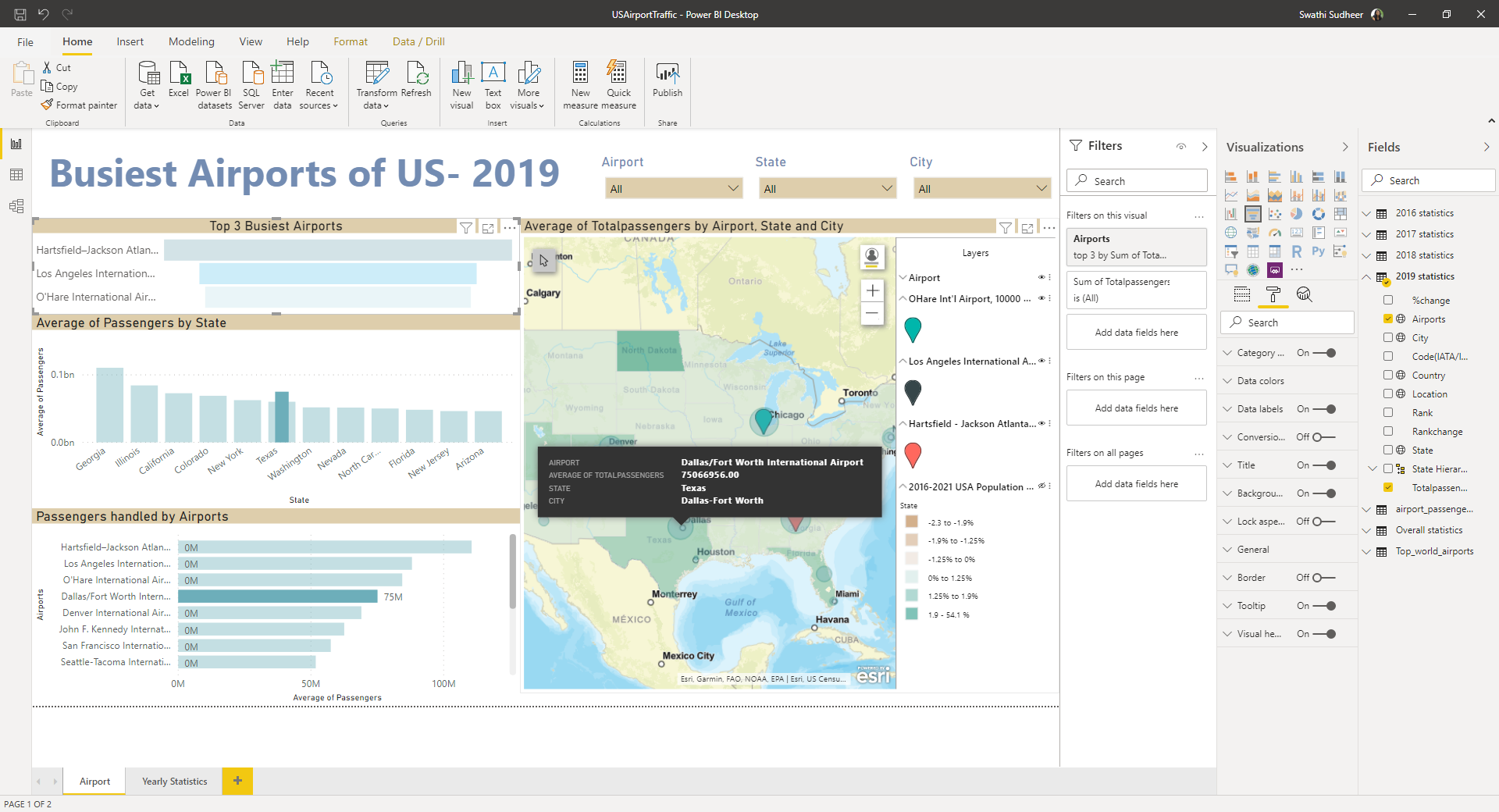
Figure 7 Tooltips
Point of Data
On selecting a point of data such as a pin or a bubble, Power BI displays a tooltip with details based on the selected area. It also cross filters the other visuals on the reports page based on the selection.
There is a feature to draw a square over some area based on which Power BI highlights the selection and cross filters the column charts accordingly.
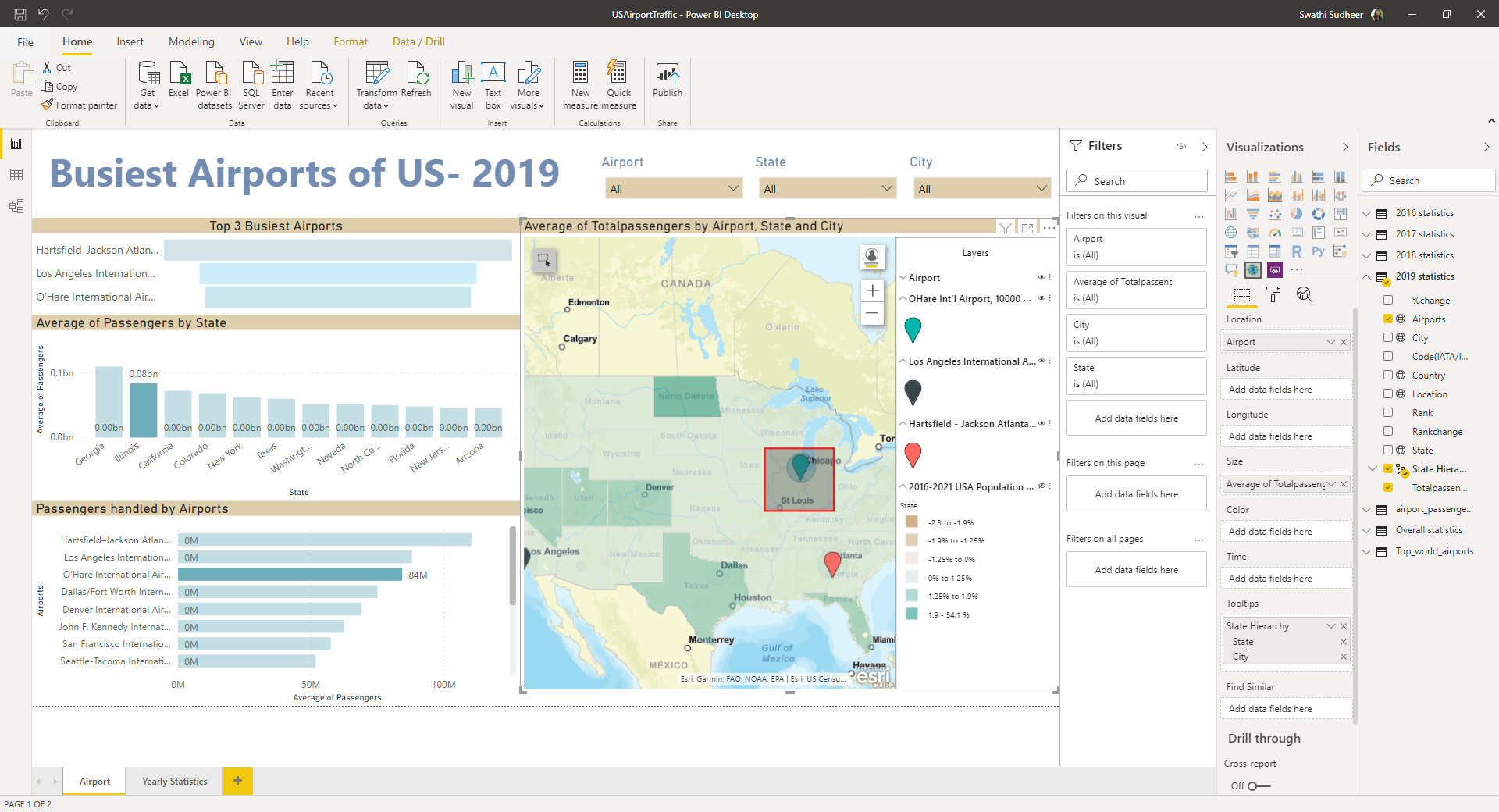
Figure 8 Point of Data
*Image Credits and Reference: www.microsoft.com & www.esri.com **Content Credits: DPS Bali & Swathi Sudhir